Visualising a fully connected neural network classifying MNIST digits
The visualisation shows a fully connected artificial neural network classifying MNIST handwritten digits (digits shown are from the test set).
The net consists of an input layer, an output layer, and no hidden layers:
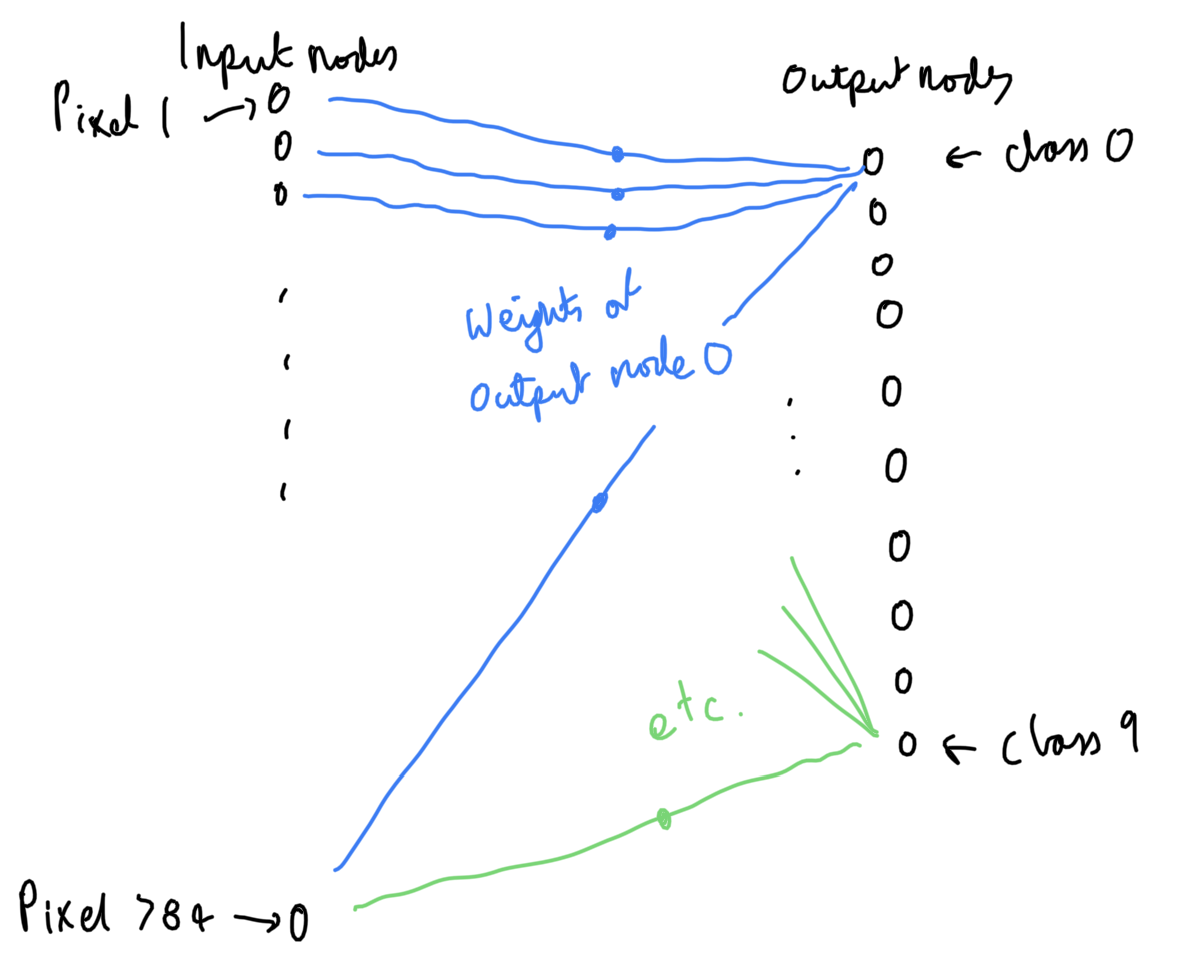
Each column in the visualisation corresponds to an output node, and each output node corresponds to a class (from 0 to 9). The largest value output node (i.e. the tallest bar on the bottom row) tells us which class is predicted. Green highlights the true class, and orange highlights an incorrect prediction.
How this neural net works
From the visualisation, we can see that:
The weights of the 0 column tend to make 0 digits larger (relative to the other columns), when multiplied and summed. I.e. 0s tend to look more white in the third row of the 0 column of the visualisation, and to have a larger bar in the fourth row.
Also, the weights of the 0 column tend to make a non-zero digit smaller (relative to the column of the non-zero digit), when multiplied and summed. I.e. non-zero digits tend to look more black in the third row of the 0 column of the visualisation, and to have a smaller bar in the fourth row.
And this applies to the other columns, and their respective digits.
Seeing digits in the weights
When we look at the weights corresponding to a particular digit, we see dark spots in the places where the digit tends to have low value pixels.
We also see light spots in the places where the digit tends to have high value pixels, and where other classes tend to have low value pixels.
The result, is that we can (kind of) see the digits, in the weights shown in the visualisation.